Category: Design & Art Direction

  • Topo-Soteriology 2017

    Topo-Soteriology 2017

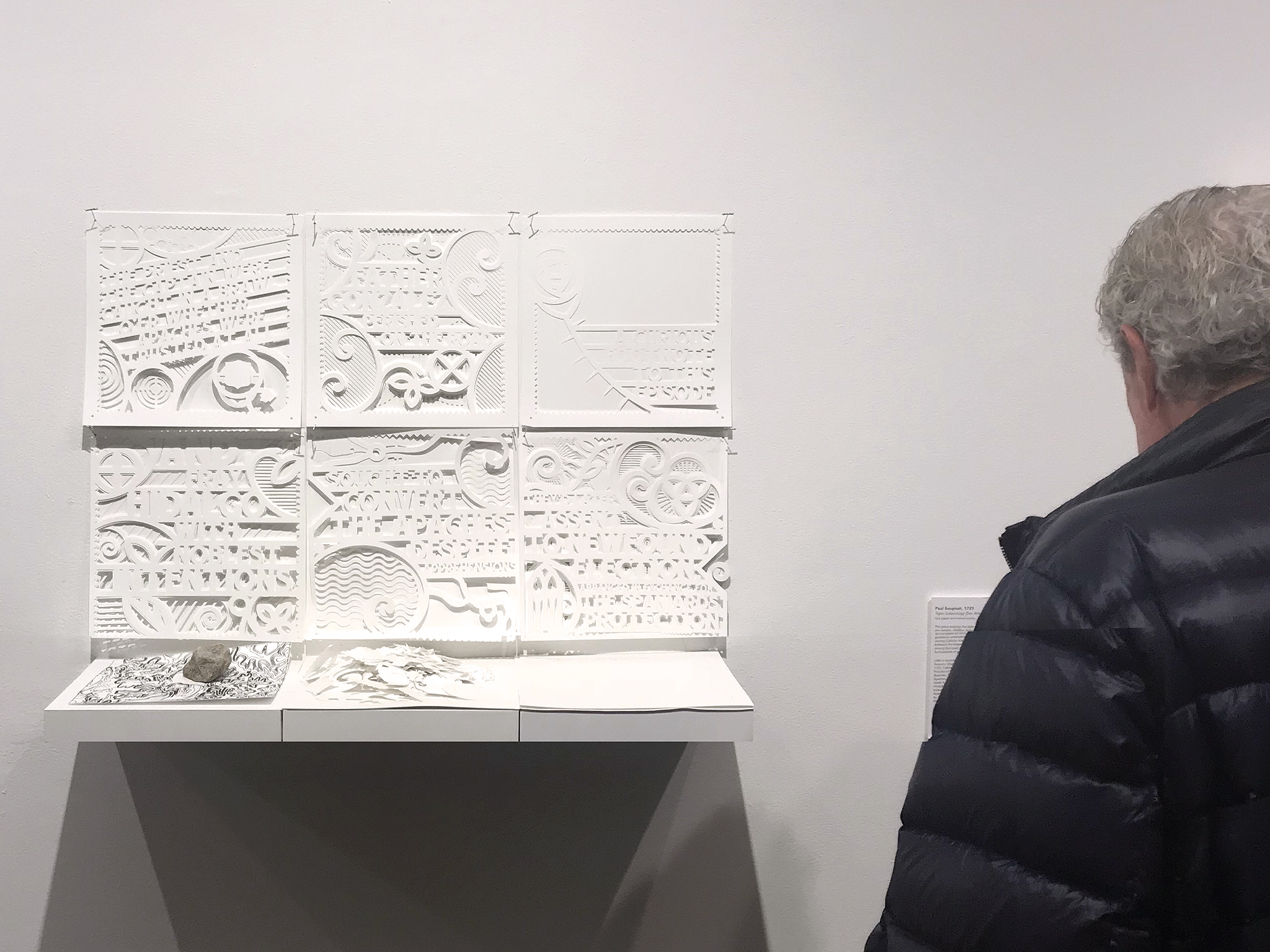
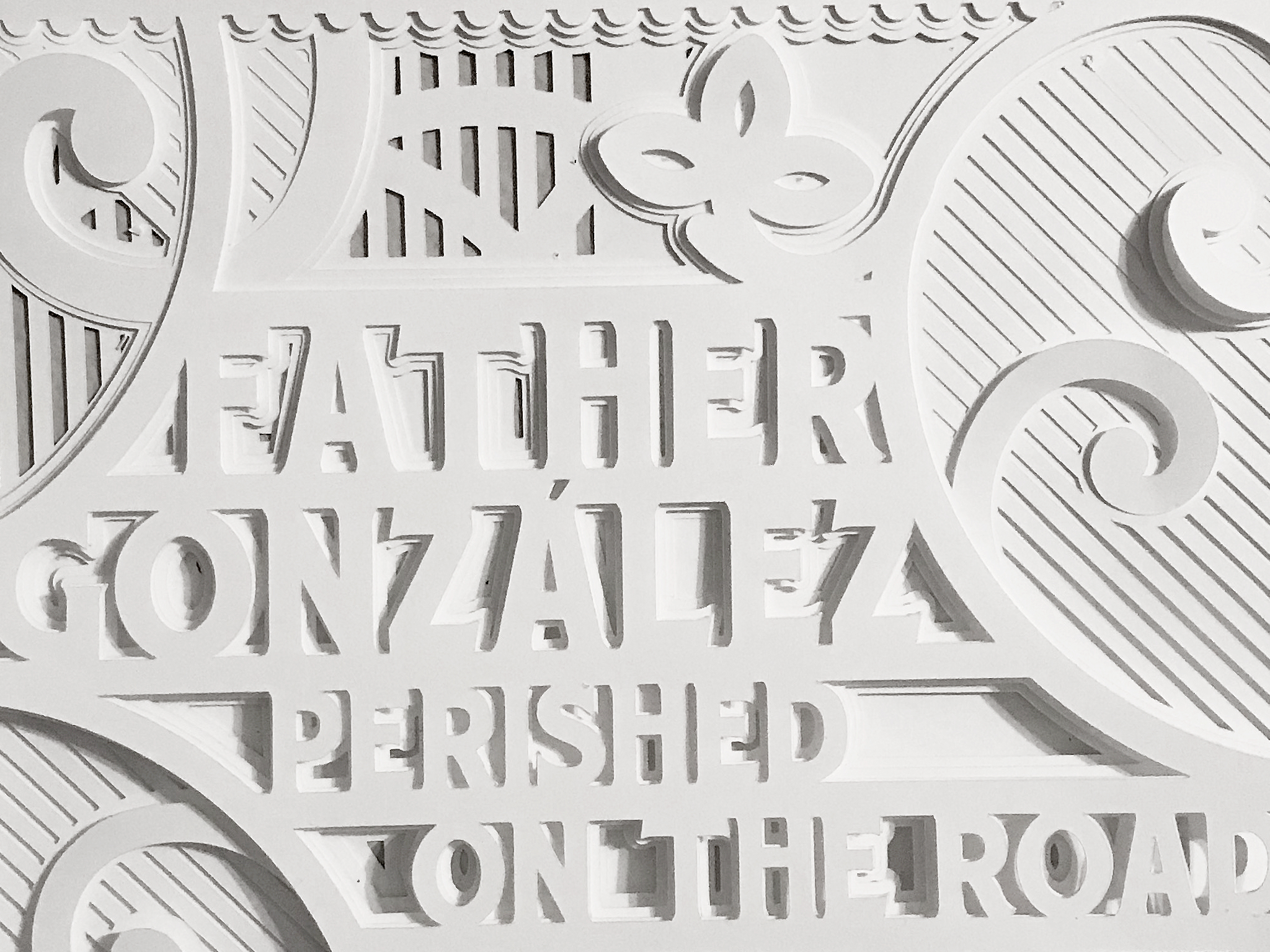
    1725: Topo-Soteriology (San Antonio Primer)
    Paul Soupiset, 2018
    Cut Paper and Mixed Media, 30 in. x23 in.
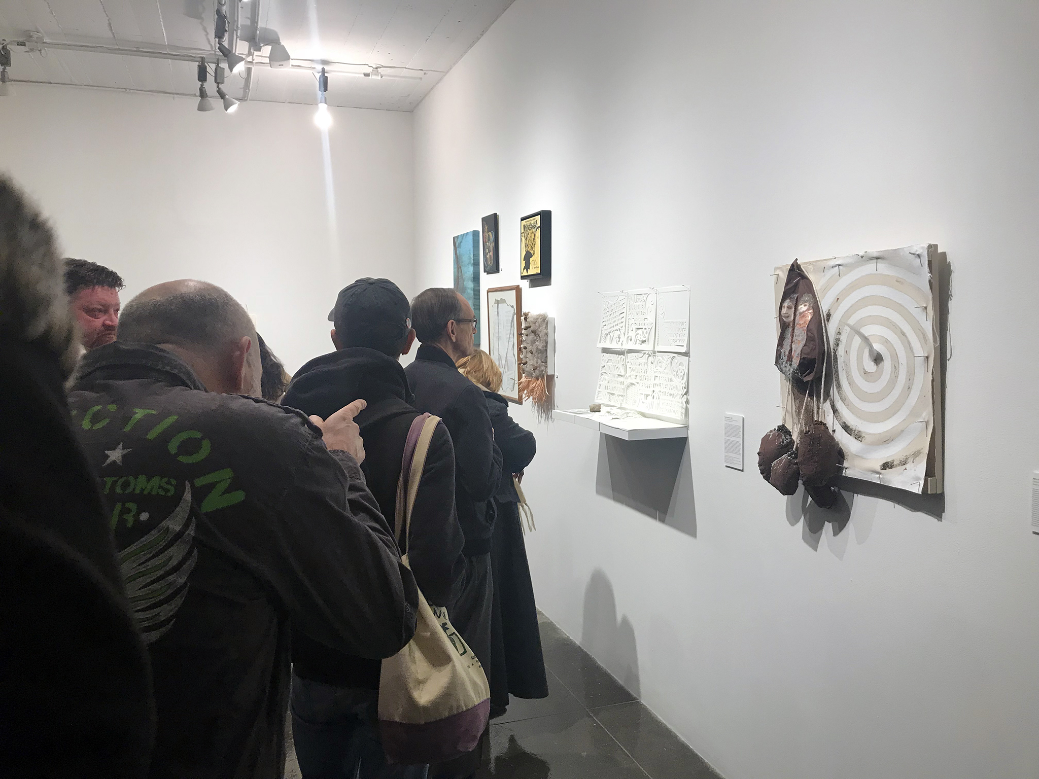
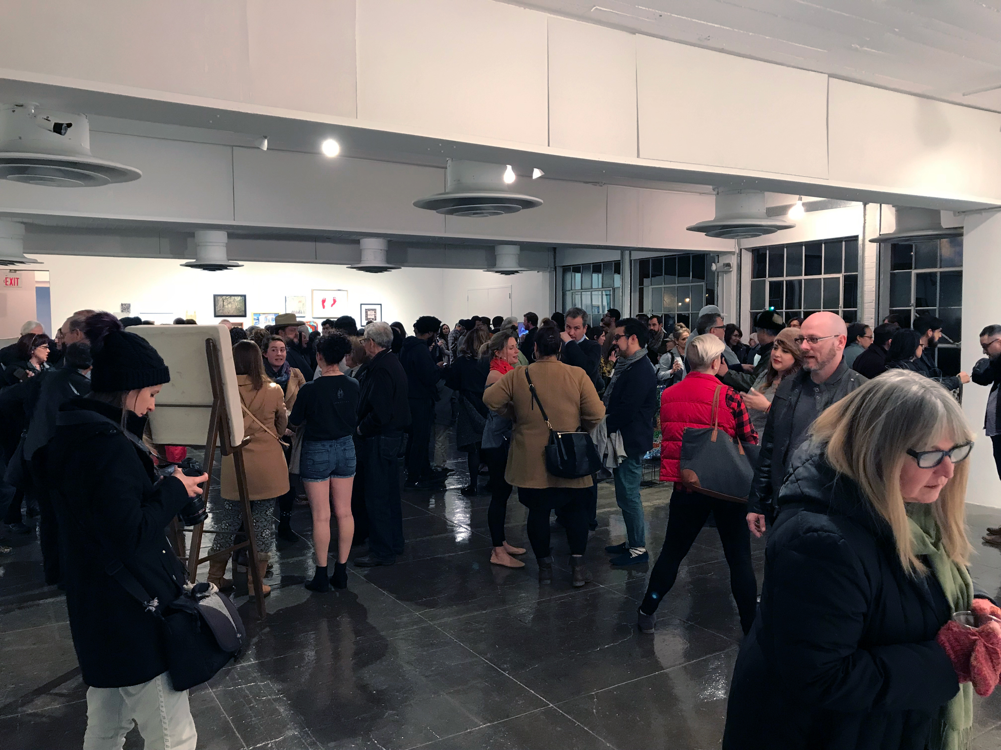
    Art Pace — Common Currents Exhibition


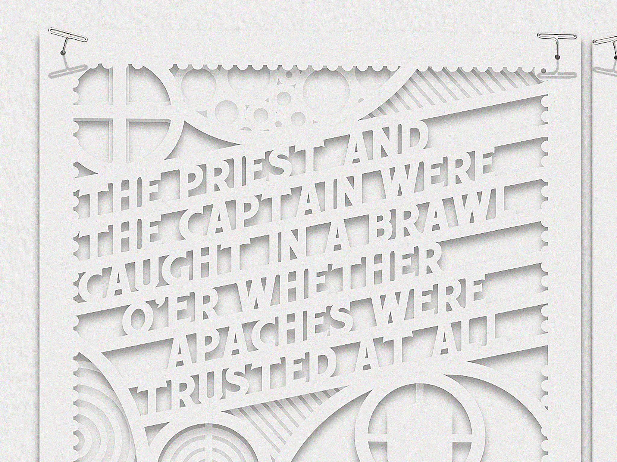
    This piece employs the style of 17th century colonial primers—simple, childlike, didactic verses—paired with a visual process that attempts to step humbly into the tradition of papel picado. I explore/appropriate both the colonialist’s catechistic style as well as the indigenous Pueblo-Huixcolotlan cut-paper artform. I explore the top-down-versus-grassroots ambivalences therein that echo the tensions among Catholic missionaries vis-à-vis Spanish officers (and between the larger institutions each represented), and among the Lipan Apaches who had inhabited parts of Texas for hundreds of years prior.

    Little is recorded about local life in 1725 Viceregal San Antonio. One inhabitant at Mission San Antonio de Valero in 1725, Father José González, argued with the captain of the Presidio of San Antonio de Bejár over the treatment of the Apaches. “…overcome by his desires of peace with the Apaches1”, González was recalled to Querétaro, but never made it; reports say he “perished on the road.2” Another inhabitant, Father Francisco Hidalgo “grieved to see the repeated slaughter which resulted from the war with the Apaches3” and sought permission to evangelize the Apaches. His request denied, he left San Antonio dejected only to die a year later, heartbroken.

    “Common Currents is a diverse showcase of San Antonio’s history as told by 300 local artists at six art-centric venues. Drawing on the connections that run through San Antonio’s vibrant creative community, each of the organizing partners began by inviting two artists. These initial artists were then asked to invite two peer artists until more than 300 were amassed. All of the participating artists are assigned one year of San Antonio’s history to reflect on in the development of their work for Common Currents. This exhibition is presented chronologically through a variety of contemporary media. More information on Common Currents is at commoncurrents.org.”

    1. Weddle, Robert S. San Juan Bautista; Gateway to Spanish Texas. University of Texas Press, 1968, 156-157.
    2. Castañeda, Carlos Eduardo. The Mission Era …: by Carlos E. Castañeda, .. Von Boeckmann-Jones, 1936, 253.
    3. Weddle, Robert S. The San Sabá Mission: Spanish Pivot in Texas. Texas A&M University Press College Station, 1999, 3.

  • Design: Reconstructing Audible Sigh’s Album Art

    Design: Reconstructing Audible Sigh’s Album Art

    “Quite possibly one of the best Americana records of the 90’s.
    No, make that one of the best records, period.” — Paste Magazine

    Earlier this year, Bill Mallonee of Americana legends Vigilantes of Love (VoL) set up a Kickstarter campaign toward the release of what was arguably their most celebrated album, Audible Sigh, as a 180g vinyl reissue. The campaign created a limited edition of 200 copies of the album that Paste included in their 50 Best Alt Country Albums of All Times. Produced by Buddy Miller, and featuring appearances by Nashville greats Emmylou Harris, Brady Blade, Phil Madeira, Buddy and Julie Miller.

    My task was to re-create the iconic Audible Sigh album cover I had first designed in 1999 when Rhythm House Records was my client. No digital files existed in archives, at least according to the original agency. I then set out on a multiple-month journey to recreate the cover and re-interpret the inside art as a 12″x12″ four-panel gatefold album jacket. The work progressed slowly, in the margins of my time, usually in the evenings.

    I reconnected with Lex Thompson who fortunately still had the digital copies of the band photos. I researched and rediscovered an archival photo of questionable resolution that I had sourced and licensed in 1999—by a now-defunct company—as a fitting cover photo. I digitally re-created the typography, distress-marks, stencil overspray, and logo, and scoured my archives to find the pieces and parts of the back cover: a scrap of a wall texture, a scan of a mechanic’s claim card number, and a public domain woodcut of a bird. These were all reassembled as the album took shape.

    What follows are a few process photos from the job:

    VOL-AudibleSigh-Rebuild-Process

    Easter egg: in the original tray card, the two scraps of paperback text were inscrutible; this time around, I knew that the 12″ x 12″ footprint would mean some fan would be examining the art to see what the text said; I decided to recreate them using pages from Frederick Buechner’s Godric, a story dear to both the songwriter and me.

    VOL-AudibleSigh-Rebuild-Process2

    Bill and I worked through the liner notes’ placement, readability, and bandmate photos. in an iterative process:

    VOL-AudibleSigh-Rebuild-Process4 VOL-AudibleSigh-Rebuild-Process4B VOL-AudibleSigh-Rebuild-Process4C

    VOL-AudibleSigh-Rebuild-Process3

    VOL-Vinyl Record MockUp

    “Bill Mallonee… [has] remained fascinated with the shadowy emotional toils and struggles inherent in the American experience, compelling, insightful, [he] continues to probe through Americana rock and roll proving that sometimes the only story worth telling is that of the journey.”
    Rolling Stone Magazine

    21122516_10155679112154595_1331014201813749506_o

  • 7 Recent Book Cover Designs

    7 Recent Book Cover Designs

    Seven book covers I’ve designed in the past couple of years for Eerdmans, Harper One, Chalice Press, Material Media, and Church Publishing.

    AUDEN-Shadow Smith-Shadow spokes-Shadow Shane-Shadow PsychWard-SHADOW-CatalogComp-aRGB1800px WordsHoles-CatalogComp-aRGB1800pxDimShadowb

  • Audio Packaging Examples

    Audio Packaging Examples


    a few examples of CD covers I’ve designed over the years.

    Soupiset-AudioPackaging-2016--4-smSoupiset-AudioPackaging-2016--3-smSoupiset-AudioPackaging-2016--2-sm